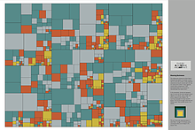
Branching Out From Science to Art

From visually depicting points scored and personal fouls of every player in the NBA to detailing the production output of hundreds of U.S. companies, computer-generated treemaps are a potent tool for taking massive amounts of data and producing a compact roadmap of usable information.
The brainchild of Ben Shneiderman, a Distinguished University professor of computer science with an appointment in the University of Maryland Institute for Advanced Computer Studies, treemaps not only provide a wealth of information for decision-makers worldwide, they’re also interesting to look at.
Last summer, Shneiderman, with the assistance of graduate student Kazi Minhazur Rahman, explored this aesthetic side of treemaps: he framed and mounted 12 of his most visually striking treemaps for an exhibit on the third floor of the Computer Science Instructional Center on campus.
The exhibit garnered much interest, with many stopping to read the detailed descriptors for the treemaps’ colored rectangles, each representing hierarchical data such as urban population or CO2 emissions.
“You have a telescope to see the big picture, and then you have a microscope that lets you look at data in a way that gives you an understanding that was not possible before,” says Shneiderman, explaining his vision for using tree maps.
He first conceived the idea in the early 1990s, when he was founding director of the university’s Human-Computer Interaction Lab. There were 14 people in the lab sharing one hard disk, Shneiderman recalls, and he needed to visualize how much disk space each person was using.
“I had many, many designs that didn’t work,” he says, “and then one day, in the fourth-floor coffee room, I suddenly had the idea about how to do it. It took me three days to get it exactly right.”
As treemaps gained momentum in the scientific community, Shneiderman began to see them from a more aesthetic point of view.
Edward Tufte, a professor of political science, statistics and computer science at Yale University and a renowned advocate of data visualization, wrote in a letter to Shneiderman in 1990 of his enthusiasm for treemaps in their early stages.
“I love the trees, especially the high-density sets of tiles,” Tufte wrote.
Now, almost a quarter-century later, Shneiderman has decided to pursue the artistic side of data-driven treemaps. He says modern 20th century artists, such as Josef Albers, Hans Hofmann, Piet Mondrian and Mark Rothko, inspired him.
There are four aesthetic elements of treemaps, Shneiderman says: layout design, color palette, aspect ratio and border prominence.
For the campus display, he manipulated colors and border thickness while also eliminating unwanted text and numbers to produce a visually appealing work of art.
Shneiderman notes that his Treemap Artwork goes on display at the National Academies in Washington, D.C., in fall of 2014, and he leaves open the possibility of giving his future scientific projects a similar aesthetic twist.
“Now I’m returning to my regular work in data visualization, but who knows?” he says. “I like doing new and different things, so depending on how much response and interest there is [to the artwork], we’ll see if I go back to it or try something else.”
—Story by Hyon-Young Kim
